


.jpg)


Technical
On the move
Visionary
Easy
Payoff
Our Payoff can be presented in a number of ways when used as a standalone message or graphic. We can choose to write IT with lower or upper case letters, as they both carry values that we want to present. It can be presented both with and without punctuation, and be spelled out in any of the typefaces provided in the visual identity.
We run IT.
We run IT
We run it.
We run it
Typography
The typeface we use to carry our brand message is Neue Haas Grotesk. To keep it short – this is Helveticas cooler predecessor. A typeface that is versatile yet reliable. One of the world’s most well-used – and rightfully so. It is one of great character, versatility, and strength. But also filled with humanity, ease, and most and foremost, readability.
Depicted here are the weights in the family that we work with. There will be times when you won't be able to work with Neue Haas Grotesk, and in those situations, we work with the corresponding weight from the Helvetica Neue or Helvetica family. If that is not possible, and you have nowhere else to go, maybe you are working in Powerpoint on a PC – Then we use Arial.
Always use Bold for headlines. Typeset all text and paragraph text in Light or Regular. Use Medium for links and buttons. Always typeset with Optical kerning for print. Do not set in all-uppercase or all-lowercase.
In addition to our primary typographical hierarchy, we use an MS-Dos look-a-like typeface called Perfect DOS VGA 437. Use this typeface with care. This typeface is where our graphic elements, the pixels, originate from and is an important part of the profile, but it should be used in balance with the other elements of the identity.
Due to license claims, the typefaces cannot be included in the toolkit, and need to be purchased by the end user, for example from www.linotype.com. Where you can decide on the number of users, desktop/web usage, and preferred payment form.
Neue Haas Grotesk Display Pro 75 Bold
Helvetica Bold
Arial Bold
Neue Haas Grotesk Text Pro 55 Regular
Helvetica Regular
Arial Regular
Perfect DOS VGA 437
Icons
Stemming from the pixel idea, we have a small library of icons to use in the identity. They are sharp and playful, displaying only the essential shapes needed to understand the message they exist to carry. They are light in weight and always set in sharp contrast to their background. They keep important functions and should be carefully considered, regarding the way they behave and what signals they send to us.
Colors
Run’s color palette is divided into two levels: The Primary and the Secondary. The Primary palette is the one that we always grab first – when painting our message and constructing the brand's top-level communication. It’s a bold and bright palette and should be used in any layout or design according to the proportions displayed here.
The Secondary palette is meant to be used for hover states, link colors, splashes, and miscellaneous situations – tools that will be needed but should not carry the primary brand communication.
C:95 M:57 Y:59 K:69
R:0 G:44 B:45
HEX #002C2D
C:60 M:0 Y:53 K:0
R:32 G:242 B:167
HEX #22F2A7
C:56 M:0 Y:58 K:0
R:108 G:188 B:145
HEX #6BBC91
C:80 M:30 Y:53 K:16
R:43 G:122 B:114
HEX #2B7A72
C:90 M:49 Y:55 K :55
R:14 G:65 B:66
HEX #0E4142
HEX #FFFFFF
C:13 M:84 Y:36 K :3
R:209 G:69 B:107
HEX #D1456B
C:0 M:0 Y:0 K:100
R:0 G:0 B:0
HEX #000000
C:0 M:87 Y:83 K:0
R:255 G:0 B:0
HEX #FF0000
C:100 M:90 Y:38 K:40
R:0 G:15 B:69
HEX #000F45
C:9 M:5 Y:57 K:0
R:235 G:224 B:112
HEX #EBE070
Graphics
When it comes to graphics we use what we got and don’t design for decoration. We design with purpose and meaning, always striving to elevate our message and position through powerful dispositions and artistry. The idea is to lift what is not seen – to elevate what happens behind the scenes. With our graphics, we illustrate the code behind the magic and the pixels that build the images.
The building block for this is the square, the pixel. Which can be used in a variety of ways and works with color combinations from the primary palette and can be combined with campaign images to build backgrounds, presentations, banners, and ads.


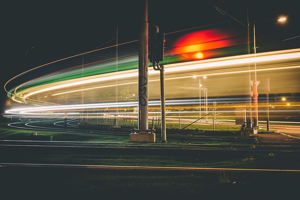
Images
The images that we use to portray our brand, are an important tool that we can use to tell the world who we are. They need to speak the language we want to speak. They need to showcase the attitude, heart, and persona that we want to attract. It is also one of the most difficult areas to narrow down and create a unified direction in, because there is always room for interpretation, let alone there are always practical factors to consider. However, in order to create both alignment and inspiration within this area, we have gathered our guidelines in the four categories below.
Logo
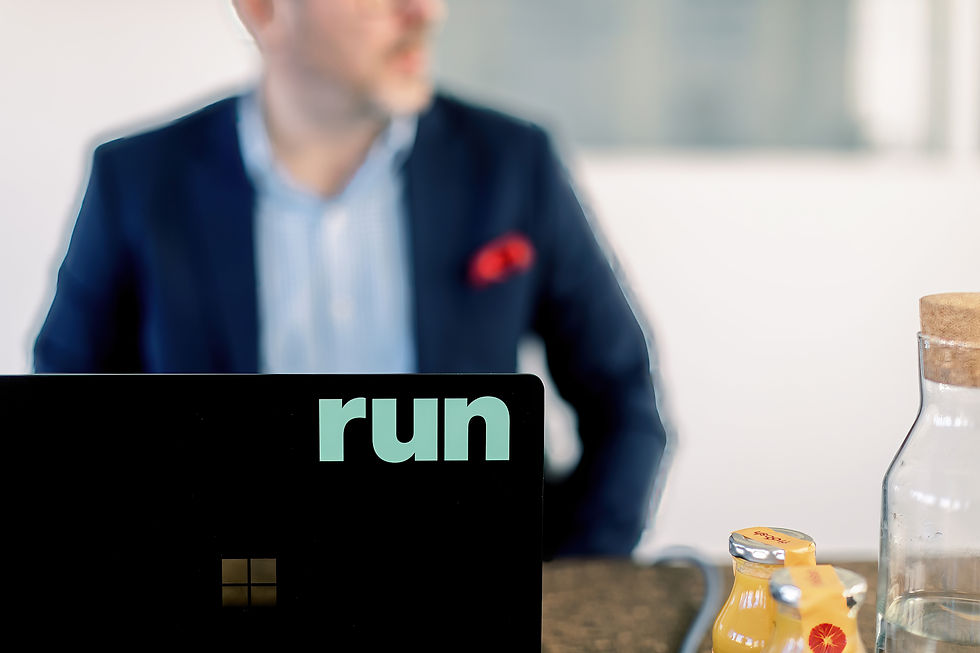
The Run logotype is an image built with the typeface Neue Haas Grotesk. It is constructed with lower case letters, to better capture the unifying shapes of the three letters, creating a solid and memorable shape. It is primarily set in a bright green color – a color meant to emphasize and align with the Run persona and role in the modern IT world, and also a small tribute to the old MS-DOS days. The logotype is available in five different colorways.
The full-color logotype should be used only on white, black, or dark green backgrounds. Avoid using full-color logotypes over images unless the logo sits on a dark or white area of the image. The required free space around the shape is equal to the width and height of the u-shape. See usage examples for color and free space.
The logotype is to be regarded as an image or icon and has nothing to do with how we spell the company name. The name is always spelled "Run". Never "RUN" or "run". The logotype can also be used together with the Run payoff, “We run IT.”
Always use the logotype files provided. Please regard the following:
- Do not crop the logotype
- Do not change the transparency of the logotype
- Do not distort the logotype
- Do not use any effects on the logotype
- Do not re-create the logotype using other typefaces
- Do not outline the logotype
- Do not rotate the logotype
Logo symbol
In addition to the primary logo version, we can also use the icon, as a standalone messenger. This is applicable whenever the available layout space is smaller – for example in mobile applications, profile images, or smaller stationary items. The icon is constructed with the same framework as the rest of the graphic elements, and is built upon the pixel shape, accompanied by the lower case “r” of the company name, enabling a more versatile way of working with the word image of the Run brand. The required free space of the icon is equal to the square width and height.